
Monday, July 6, 2009
Basic design principle – Alignment
Today’s post will be about the design principle of alignment. New designers often violate this design principle by putting text and graphics on the page wherever there happens to be room. Often this can leave a layout looking unorganized and unprofessional. By aligning objects, you can give your pages and designs a feeling of harmonious visual appeal.
The principle of alignment states that nothing should be placed on the page arbitrarily. Everything on a page should have a visual connection with something else. Following this foundation forces you to be conscious about the decisions you make.
Have a look at the photo below. This is my coffee table with several random items on it. Although each item is separate and distinct; your mind is trying to connect them into a cohesive relationship. Because there is no pattern of alignment, individual elements fight with the overall composition.
Wednesday, July 1, 2009
Basic design principle – Contrast
Today’s post will be the first in a series on four basic principals of good design. I call these the “Basic Principles” because they are the foundation of how all good designs should look. These four foundational principles are: Contrast, Repetition, Alignment, and Proximity. Although I will be talking about each principle separately, keep in mind that each are interconnected, and no single one holds more weight than the others.
First, I must caution you… You are about learn something.
For today, I will only tackle the principle of Contrast. Contrast is one of the most powerful ways to add visual appeal to your design. If your page is striking, a reader will want to look at it longer.
Wednesday, June 24, 2009
What grinds my gears? - Color Names!
There are many aspects of being a graphic designer/artist that I must deal with every day. Consistently, however, it always seems like the simplest details become the things I dread so much. Today’s post I will talk about one aspect that really sets me off – The naming of colors!
When I was young, colors were simple. I was never one of the kids with the 64+ box of crayons. No, my color palette was usually limited to the 24, well named, and often unorganized box of colors. It’s pretty easy to name 24 colors; Brown, blue, green, yellow, etc… From those, you can get lighter and darker variations: Light brown, dark blue, yellow-green, and so on. I enjoyed these colors names because they told me exactly what color I was picking up. A “yellow-green” crayon would predictably give me a greenish color with the hint of yellow. A “Light Brown” would yield a tint of brown. Yes, when I was young, the world was my oyster and colors were simple.
When I was young, colors were simple. I was never one of the kids with the 64+ box of crayons. No, my color palette was usually limited to the 24, well named, and often unorganized box of colors. It’s pretty easy to name 24 colors; Brown, blue, green, yellow, etc… From those, you can get lighter and darker variations: Light brown, dark blue, yellow-green, and so on. I enjoyed these colors names because they told me exactly what color I was picking up. A “yellow-green” crayon would predictably give me a greenish color with the hint of yellow. A “Light Brown” would yield a tint of brown. Yes, when I was young, the world was my oyster and colors were simple.
Saturday, June 20, 2009
A PowerPoint Problem!
Here’s a common problem recently faced by one of my friends while using PowerPoint. In the image below, there are two pictures on one slide. The one of the left has a white boarder around it, while the other is transparent. How do you get the transparency?


Friday, June 19, 2009
Tutorial - How to create your own brushes in Photoshop
Here is another hopefully beneficial tutorial for those who have ever used Photoshop. Today I’m going to show you how to create your own brushes and brush effects in Photoshop. You can do a quick Google search for “Photoshop Brushes” and get thousands of websites that allow you to download (for free or pay) various brush sets. Hopefully, by the end of this blog, you’ll be able to save yourself some money by being able to make your own brushes.
First off, lets do a simple set up. Open a new document with a white background. For the sake of simplicity let’s keep this document in Grayscale mode. (Though you can always use any other color mode).
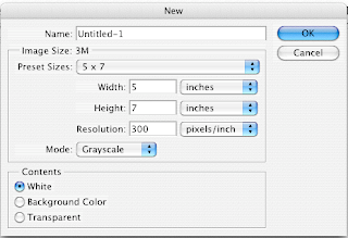
First off, lets do a simple set up. Open a new document with a white background. For the sake of simplicity let’s keep this document in Grayscale mode. (Though you can always use any other color mode).

Wednesday, June 10, 2009
The Difference Between RGB and CMYK

What’s the difference between CMYK and RGB color modes?
This is a common question faced by new digital designers and those that have ever worked with a printing company. Though there’s a lot of science involved, I’m primarily going to stick with a general answer.
First, let me flex my art-nerd muscles…
When you were in school, you probably learned that mixing colors like Red and Blue will give you a different color (Purple). Artists have known this for centuries, and dubbed this “Subtractive color mixing”. The “Subtractive” part comes from the fact that adding colors will absorb wavelengths of light and reflect others. Mixing the primary colors of Red, Blue, and Yellow can yield just about every color in the spectrum. If we throw in black and white, then you can get tints and shades of those colors.
Monday, June 8, 2009
Tutorial - Color separation using Illustrator
So to kick things off, I wanted to start with a little tutorial of something I’ve had to do a lot of as a graphic designer – color separations.
This process will show you how to color separate vector art using only Adobe Illustrator. It’s a quick and easy process that has always given me great results for screen printing. You can use this process for as many colors as you like. Just be sure to follow each step closely.
To begin, I want to note that this process will only work for artwork that has “flat colors.” There are no gradations, tints, or transparent colors. Perhaps in a later post I’ll show you how to do those using a process in Photoshop.

Subscribe to:
Comments (Atom)